- Slug: Sports-History of Super Bowl logo, 1,274 words
- 18 logos available.
By Aidan Richmond
Cronkite News
PHOENIX – On Jan. 12, 1969, Lamar Hunt won in two significant ways: when his American Football League’s New York Jets upset the National Football League’s Baltimore Colts in the game that officially would be referred to as the “Super Bowl” for the first time.
With the name came a need for a representation of it, something to put on media guides, advertisements and beyond.
The first design principle of the naming of the games and their logos came from Hunt himself when he insisted that Roman numerals dignified the event. This change would also be applied to the previous games, which were renamed “Super Bowl I” and “Super Bowl II” retroactively.
The logos took on a simple look for the Super Bowls of the 1960s and ‘70s, with a simple pair of colors and fonts reminiscent of what one might find in the depths of a modern copy of Microsoft Word’s dropdown menu.
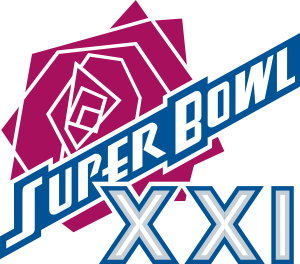
With the ’80s came an era of expanded creative liberty from the NFL, as the logos took on a new approach of putting Hunt’s Roman numerals front and center, with some additional design flair added that was previously missing (with the notable exceptions of the 1981 and 1982 Super Bowls).
The new branding for the NFL’s premier game was more prominently displayed at both 35-yard lines between the hash marks starting with the 1980 Super Bowl, the first to actually feature the widely accepted logo. The previous four Super Bowls featured designs in the same positions, however they were simple, containing only the event’s namesake and the appropriate Roman numerals over a silhouette of the NFL shield.
From 1983 to 1993, the Super Bowl logo took on only three constants: The Roman numerals, the “Super Bowl” name and a patriotic trio of red, white and blue. Each logo had its own outline and character, something that separated it from the year before and the year to come, with the notable exception of a fresh color palette.
This consistency did two things for the NFL. It maintained the colors of the league in the branding of their most important event and it represented a sense of patriotism in a truly American sport.
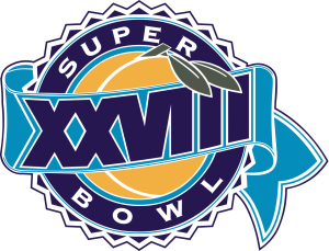
In 1994, the NFL broke the pattern it had created by putting a peach as the centerpiece of that year’s Super Bowl, reflective of the host state of Georgia. Suddenly, the logo reflected not just the league, but the city or state that would be hosting the big game.
“Maybe the Super Bowls in the thirties might have been my all-time favorite, where it walks a fine line between the host and the game,” Sportslogos.net founder Chris Creamer said.
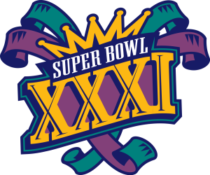
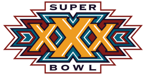
This reflection was done in several ways, some more obvious like the Mardi Gras theme that the 1997 Super Bowl’s logo took on, others through subtle means, like the 1996 logo, which used a uniquely southwest color scheme of red and turquoise as nods to the host state of Arizona.
During much of this period, it was not the NFL doing the actual work designing the logos, but firms and artists creating memorable logos that would immortalize their work in the history books of the biggest annual sporting event in the United States.
Todd Radom, designer of the 2004 Super Bowl logo, still views it as his favorite gig almost 20 years later. That sentiment is not insignificant coming from Radom, who has worked directly with several leagues, teams and organizations. His designs include the logos for several MLB all-star games, the Anaheim Angels, the Naismith Memorial Basketball Hall of Fame and the 2009 NBA All-Star Game in Phoenix.
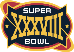
Radom’s creation, made for the Houston-based Super Bowl, paid homage to the “Space City” through its Astros-adjacent colors, the ringed planet shape and “Super Bowl” being depicted in a font mimicking that of NASA’s.
Radom was also involved in the creation of the logo for the following Super Bowl in 2005, which depicts the Main Street Bridge of Jacksonville, Florida, one of the very final Super Bowl icons to display the host city through more than just a silhouette of the game’s stadium.
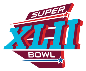
Two years later, the 2008 Super Bowl saw the undefeated New England Patriots fall to Eli Manning and the underdog New York Giants at State Farm Stadium (then University of Phoenix Stadium) in Arizona’s second Super Bowl, headlined by one of the greatest plays in Super Bowl history. The game was represented by a logo that left no question regarding the location of the game, with desert red and orange acting as the most prominent part of the logo underneath a turquoise “XLII.”
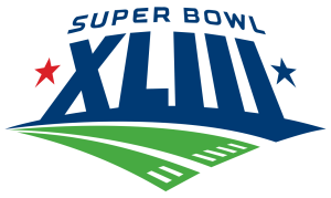
The following two years produced logos that had themes and color schemes, but failed to allude to much beyond the concept of football itself, with 2009’s logo depicting “Super Bowl XLIII” atop a football field, and 2010’s utilizing a football going through goalposts as its centerpiece between the ‘L’ and ‘I’.
“Once we got into (Super Bowl 40), you can see they’re starting to play with the idea of a standardized look. Starting with 40, it’s the same font for the Super Bowl every year, there’s a red and a blue star every year,” Creamer said.
Then the Lombardi arrived. And with it, a modern, corporate and silver rendition of the “Midas touch.”
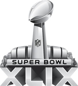
In 2011, the NFL elected for standardization over creativity, changing the Super Bowl logo into a predictable affair. The logos from 2011 to 2015 featured the Lombardi Trophy above all, shadowed by an all-silver depiction of the host stadium over the name “Super Bowl” and the appropriate Roman numerals. This includes Arizona’s most recent Super Bowl, the only one not depicted with some combination of red and turquoise.
“It was a curious thing,” Radom said of the change.
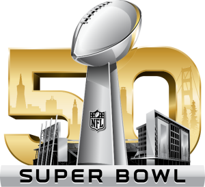
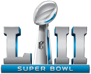
The league brought some color back for the 50th Super Bowl in 2016, dropping the singular Roman numeral “L” for a large gold “50,” with hints of the San Francisco skyline painted onto it. From 2017 to 2021,the Roman numerals and the Lombardi Trophy were positioned at the same level, using the award to separate the “L” from the remaining numerals, with an accent color changing year to year (for 2020 and 2021, two accent colors were used).
“Very slick, very corporate, I think that was the main complaint when things went to a standardized look,” Radom said. “It’s the NFL, it’s the ‘No Fun League.’”
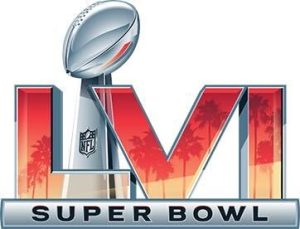
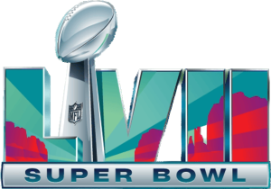
Finally, there came the most modern era of Super Bowl logos, which started in 2022 with the accent colors exchanged for a locally-focused design painted onto the Roman numerals. For the Los Angeles Super Bowl, this came in the form of several palm tree silhouettes in a sunset color scheme. For 2023 in the Valley, a turquoise sky backgrounds a red-rock desert landscape.
“Comparing the last two Super Bowl logos to 45 through 55, it’s night and day better,” Creamer said. “What they’re doing now, it’s still not perfect, but I would call it an ideal compromise between what the NFL clearly wants, which is a standardized logo that is exactly the same from year to year … to what the fans really want: for each Super Bowl to have its own identity.”
The NFL is not alone in its design shift over the past several decades. It may be that digital media and the growth of the smartphone have heavily influenced a worldwide shift to a more simplified look.
“You get into the ‘80s and ‘90s when digital technology starts coming in and teams can start adding gradients and they can start sublimating things and the number one focus is, ‘We can actually sell merchandise with this stuff on it and make a lot of money,’” Creamer said of the shift. “You look at the 2010s and 2020s and where logos are presented the most now, and that is on a digital cell phone screen … A nice simplified logo that can fit into a profile photo, and you’ll notice that a lot of detail gets stripped away.”
Creamer has already begun coverage of next year’s logo, which will likely keep consistent with the 2022 and 2023 Super Bowls. For football fans around the world, especially those in the Valley, the logo will be front and center leading up to the big game, one that reflects their community.
For more stories from Cronkite News, visit cronkitenews.azpbs.org.


