- Slug: BIZ-new access symbol, 800 words
- New icon available below
- W/box
By GINGER POULSON
Cronkite News
PHOENIX – You’ve seen the blue and white stick figure in the wheelchair everywhere – in parking lots, on buildings, in windows.
The graphic image is one of the most recognizable symbols in the world.
But you may start seeing a new image pop up around Phoenix.
The city recently granted permission for businesses to replace the International Symbol of Access, which was created in 1969, with a new icon.
The new image shows a more active figure. It’s still blue and white. But it emphasizes ability rather than disability, officials said.
Advocates for the change cheered the move.
“When you think about the old icon, you really see more of the chair versus the person. It’s described as something that’s unnaturally erect with mechanical parts,” said Angelica Greene, a clinical program manager at Cigna. “But when you look at the new icon, you’re looking at someone that’s active and engaged, the person that’s in control of their own environment and able to make decisions. Those are things that were not present when you look at the old icon.”
Greene led Cigna’s efforts in Phoenix to approve the change. Cigna, a global health insurance service company, has promoted the change across the country.
Sara Hendren, a professor of design at Olin College of Engineering in Massachusetts, designed the new icon and helped found the Accessible Icon Project, a group dedicated to providing people with supplies and services they need to make the switch.
Hendren’s inspiration for the new design? The signs you see at national parks.
“If you go to a national park, and you look at the signs that tell you what you can do in that park – swimming, boating, fishing,” she said. “All of those bodies are doing really interesting things, and you can convey that information with the lines of the body really easily.”
“It’s about bringing the international symbol into line with those kind of two-dimensional icons.”
The idea started in Boston with street art aimed at raising questions about disability rights and advocacy, and the images transformed into a social campaign.
Phoenix officials approved the change on Jan. 21.
Peter Fischer, the city’s coordinator for the Americans with Disabilities Act, called the approval “a positive step in the direction for equality and equal access for everyone.”
Cigna initiated the change by requesting permission to update the signage in its North Phoenix office parking lots with the new icon.
The Development Services Department completed the approval process in less than two weeks. The federal government recognizes the new icon as compliant with the American’s with Disabilities Act. Some states, cities and institutions have adopted the symbol.
Cigna plans to replace the old signs at its Phoenix office on Feb. 5.
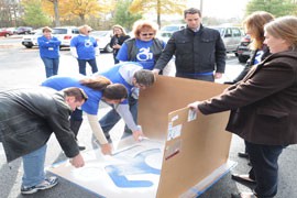
Cigna began replacements at several of its U.S. offices in 2014, including locations in Plano, Texas, and Chattanooga, Tennessee, as well as its company headquarters in Bloomfield, Connecticut.
“We’re on the cutting edge of this, so we feel very excited about the fact that we can be among the first in Phoenix to display this,” Greene said.
Hendren said she was excited to see the global reach of the social campaign.
“We have about a 5,000-person network on Facebook of people who are doing advocacy work literally all over the world,” Hendren said.
Although Phoenix officials support the use of the new icon, the city isn’t pushing businesses to use it.
Fischer said the city “will probably end up wanting to move in that direction, but there has been no specific discussion.”
Fischer added that the city itself would not retrofit its signs because of the cost, but it could begin using the revamped design in new or replaced signage.
^___=
SIDEBAR: How much would it cost to revamp your signage?
The Accessible Icon Project provides various options for retrofitting signage and parking spaces. Options include placing stickers over the old icon on parking signs and using a masonite stencil to repaint parking spaces. A free template also is available. Here is the breakdown of the costs:
Reflective sticker to cover standard parking signs (7.5 inches by 7.5 inches): $8
Sticker to cover standard parking signs (7 inches by 7 inches): $3
Parking space stencil (42 inches by 42 inches): $275
Source: Accessible Icon Project, accessibleicon.org
Move the slider to reveal the new logo. Graphic: TreNesha Striggles.


Cigna workers in Chattanooga, Tennessee, replace the old International Symbol of Access with the new one.
(Photo courtesy of Cigna)